A Necessary Stepping-Stone
Before we could implement new analysis features, users needed a better way to import geospatial data into the platform.
Design Methods: Design Thinking Workshops, Wireframes, Flows, Hi-Fi Screens
Role: Senior UX Designer
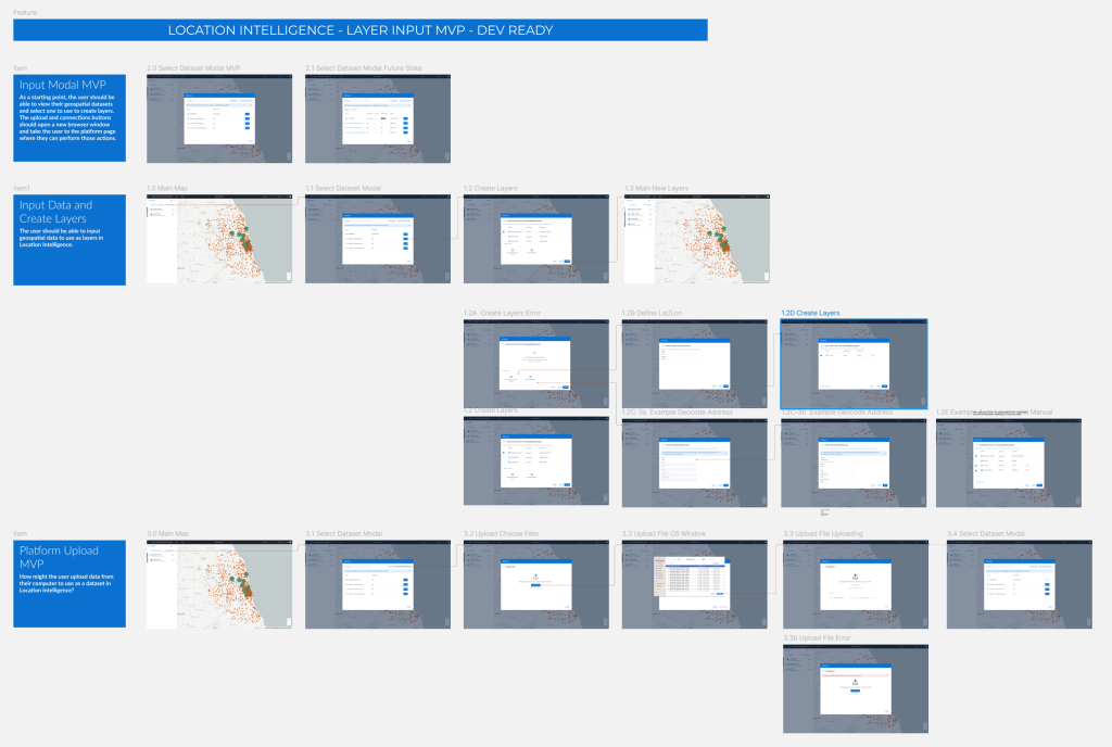
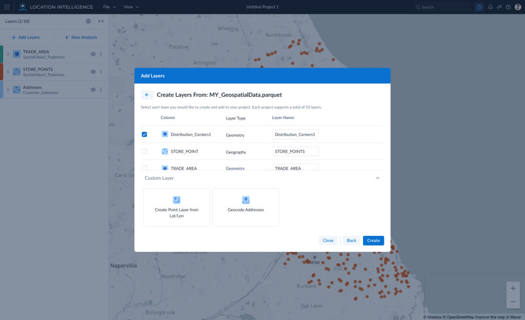
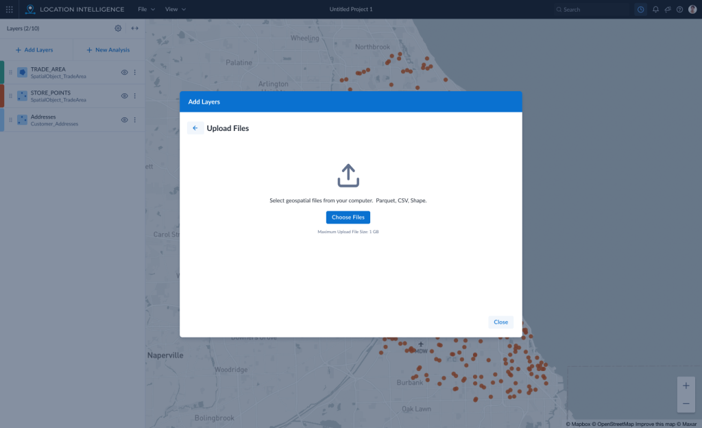
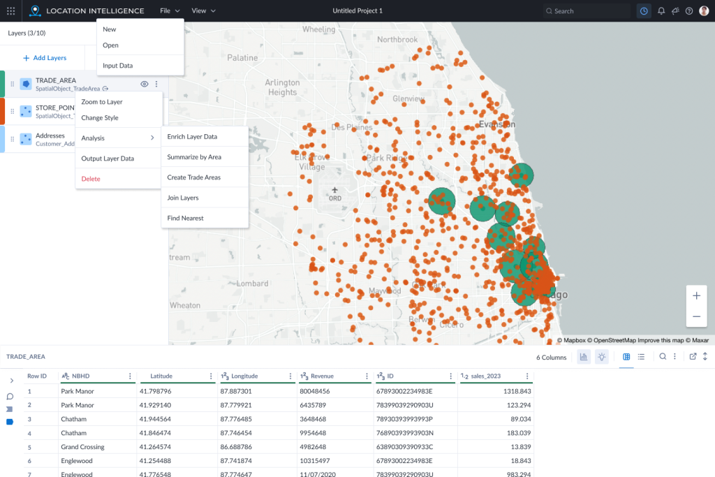
In order to visualize geospatial data on the map, it has to be brought in to the app and a layer must be created. When I started working on Location Intelligence (LI), we had a very simple upload process. As part of an overhaul, we were tasked with bringing our input process in line with a larger initiative to standardize inputs into all our cloud apps. Working closely with another UX designer in Prague, we were able to find a set of features for the input that would work while still allowing for the layer creation piece specific to LI.
Workshops
In order to speed up the design process, I facilitated a couple of small workshops with the dev team, product owner and the BA. The dev team uncovered several exception paths that hadn’t been accounted for in our designs. They also agreed to begin work on the first version of the global input modal in order to expedite its creation.
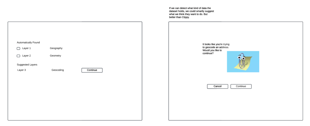
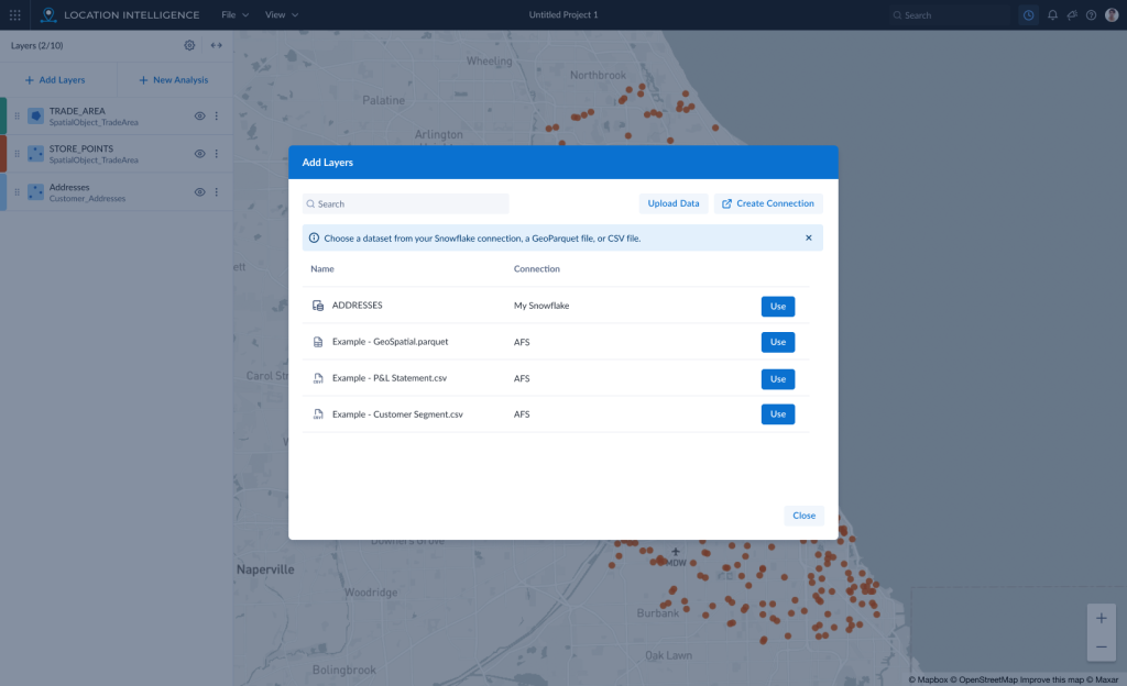
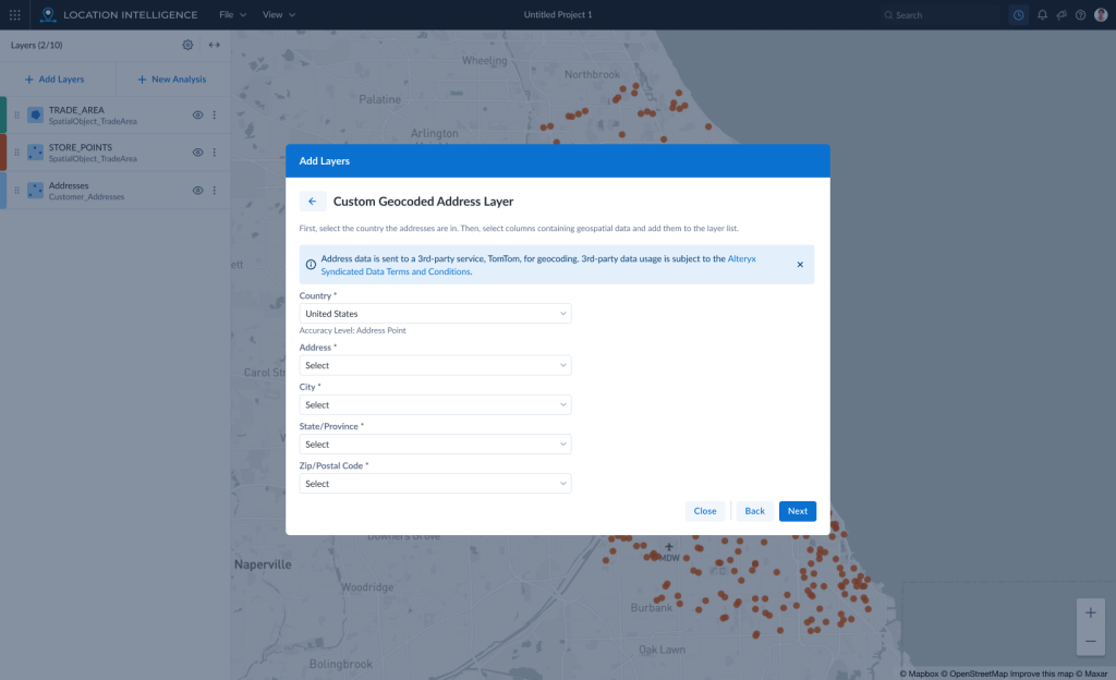
The modal was created and implemented with a subset of features. The layer creation portion of the data import flow allowed for the automated interpretation of geospatial data columns in a dataset. But, we also added the ability for the user to create their own custom point layers from either Lat/Lon columns that weren’t automatically interpreted or address columns that could be geocoded. Upon release, this was hailed by one user in particular who called this feature a “huge help.”
Inspire 2024
Because we were the first application to implement the modal, we could also be the first to test it. In May 2024, Alteryx hosted a large customer conference where users from all over the world could come learn more about the software and test new features in the UX Lab. Working with the UX Research team, we determined the application was mature enough to be able to do a “scorecard” study of the live site. We created 4 tasks that users would attempt to perform on their own with no prompting from myself as the facilitator. The software would be scored based on several factors including how long it took each user to complete each task and how easy or hard they felt it was.

Research Findings
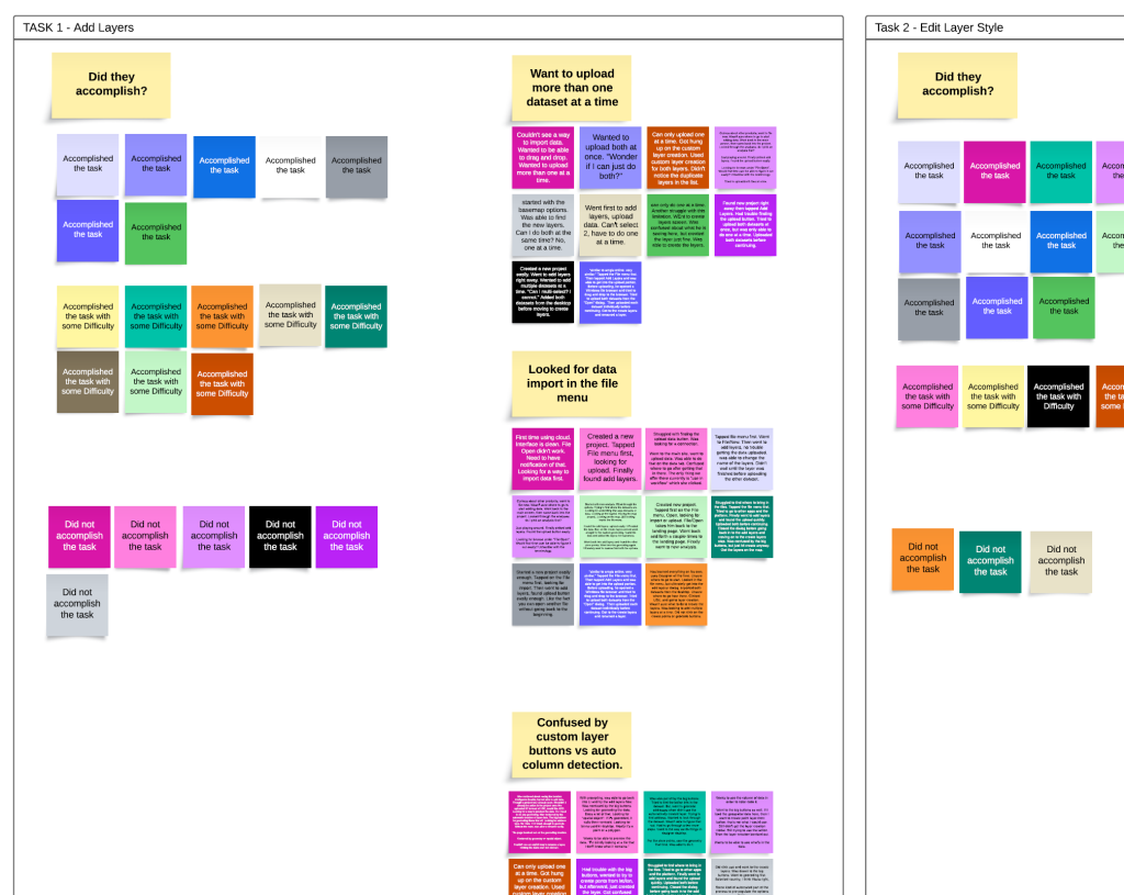
The first task revealed several issues with the data input and layer creation process. First, most of the users looked for a “data input” option in the File menu. Second, they wanted to upload more than one dataset at a time. Third, many users were confused by the automatically detected layers vs the custom point layer creation buttons. Fourth, a majority of users wanted a way to preview the data before adding a layer or performing analysis.
Recommendations
First, put the “data input” options everywhere users were looking for it. All options will take the user to the same modal window.
Second, update the file upload widget to allow the user to select more than one dataset. If possible, also allow drag and drop on this screen for better consistency with other cloud apps.
Third, update the look of the automatically detected layers to be more prominent. Make the custom layer options smaller and less prominent to reduce confusion that these are required.
Fourth, add a data preview method to the dataset view so users may see a sample of the dataset before choosing to use it to create map layers. Then, once a layer is created, add a section to the main, map UI that will show a preview of the data in a layer when that layer is selected.
Conclusion
Unfortunately, I was let go from the company before I could complete my analysis and finalize recommendations for other parts of the app. I am confident the changes found through this user testing will improve the app and I hope that the product team will be able to take my work and move it forward.