Version 2
When I moved onto the Connect IQ team, the app was in need of a re-design. At the time it was hovering at a low 3-star rating in both the Apple and Android app stores.
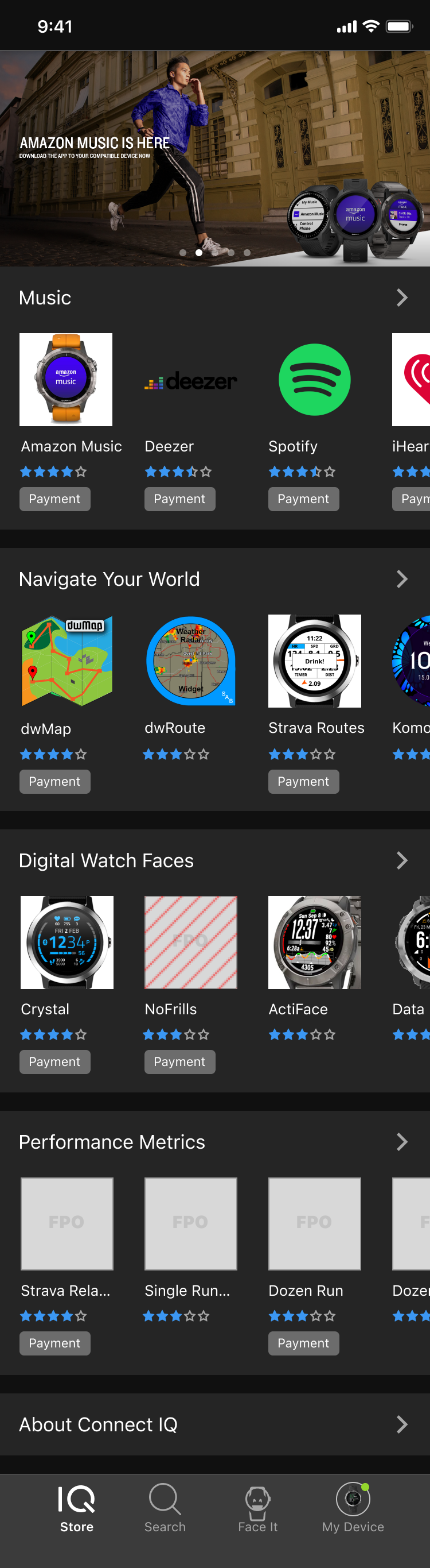
Working from screens by a previous designer, I engaged the product owner to find the most important items to put in the new bottom navigation. I fought to keep Face It, a custom watch face builder for users, in a prominent spot. Although the product owner didn’t love it, the data showed it was very popular with users and had a lot of engagement in the app.
The new layout was approved and we had a kickoff with the dev team. A problem arose with the new featured app images at the top of the main screen. Because Apple was launching the new iPhone with the notch at the top, a large portion of the images would be unusable.
I led a workshop with the product owner and the dev team to brainstorm options. The best way to handle this situation would be to give the 3rd-party developers admin tools to create screenshots that would account for this space, but still allow the images to go all the way to the top. However, after getting feedback from 3rd-party devs and talking this through with the dev team, it didn’t make sense to build those tools.
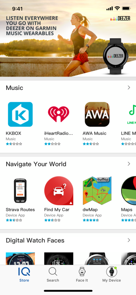
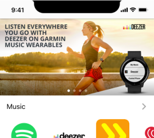
As a compromise, we moved the images down and kept the standard app bar at the top. Balancing these concerns between the business, developers and end-users made Connect IQ more complex than other projects on which I had worked.
Dark Mode
One of our stretch goals for v2 was to give the users dark mode. Working with others on the UX team, we defined a global standard for how dark mode would appear for all of our mobile apps. I worked with others on the design system team to implement Sketch components that would allow us to more quickly present dark mode versions of our apps to stakeholders.
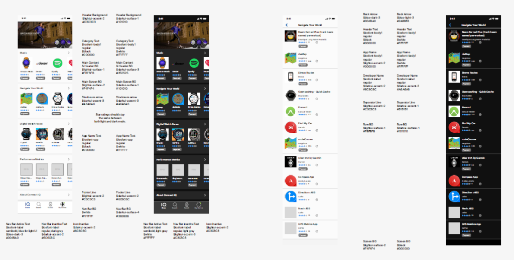
Upon implementation, however, a problem arose with how the colors were mapped between light and dark. The light version had the paradigm of a gray background with the more important elements on a white background differentiated from the background.
Unfortunately in dark mode, the paradigm was reversed with a lighter background at the “bottom” and black being at the “top” beneath the most important elements.
I worked with the dev team, design system team and stakeholders on several projects to change the color mapping so the color hierarchy made more sense in dark mode. Connect IQ was the first app to implement dark mode.
Launch
The new layout was a hit and the app started to climb in the app store. By working with other teams and gaining insights from 3rd-party developers, end-users and the product owner, we delivered a much-improved app experience.