Problem Statement
Users want more mountain-bike centric metrics saved during their activities and for that data to be shown in a meaningful way.
Concept Phase
For this project, the UX team was engaged early in the concept phase to help clarify and visualize the features. I facilitated requirements discussions between the engineers, the BA, the project manager and the device UX team.
The engineers had created algorithms to track two new metrics for mountain bike activities: Grit and Flow. Grit would measure the difficulty of a trail and Flow would the user’s performance on that trail. While the Grit score wouldn’t change very much, Flow might change quite a bit from ride to ride.
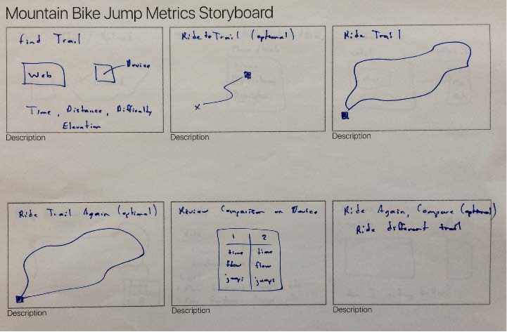
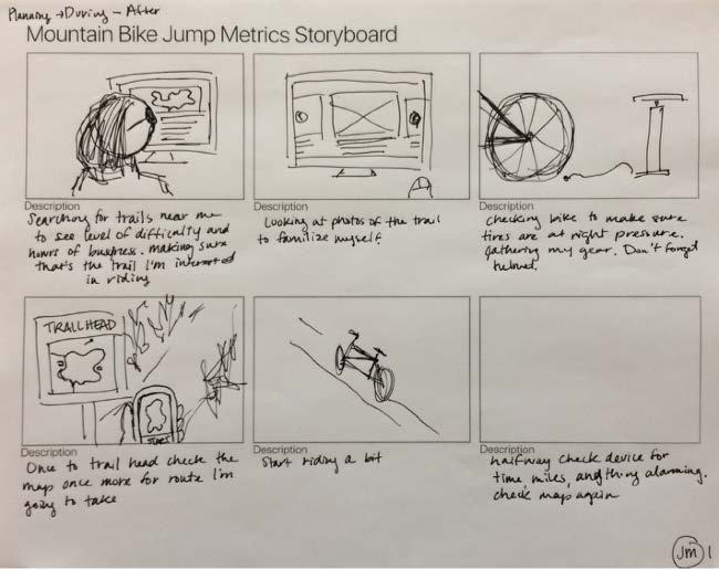
I facilitated a storyboard workshop to help everyone think about how these metrics might be best shown to the user.
Discovery
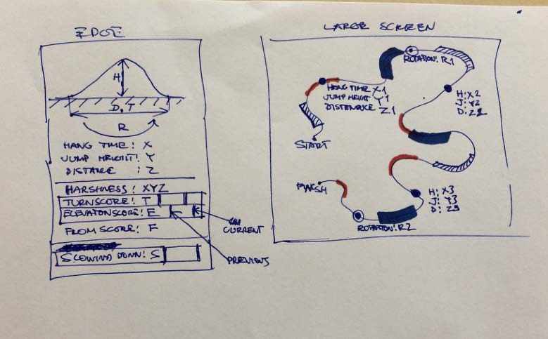
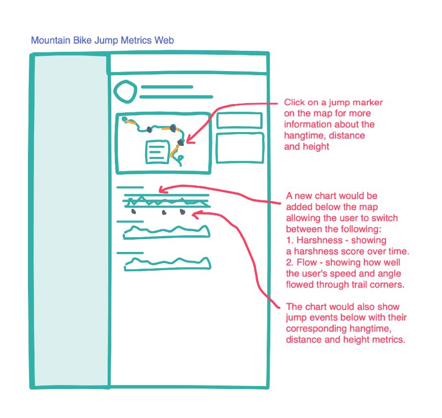
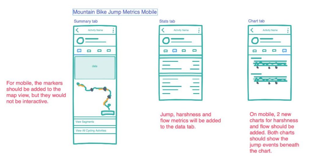
After reviewing the storyboards, I created some low-fidelity mockups pointing out some of the more prominent features. Reviewing these mockups with the stakeholders allowed us to further refine the features and get rough LOEs from the dev teams.
Delivery
Once the wireframes and flows had been approved, I created high-fidelity mockups of the screens to settle on look and feel.
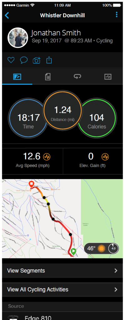
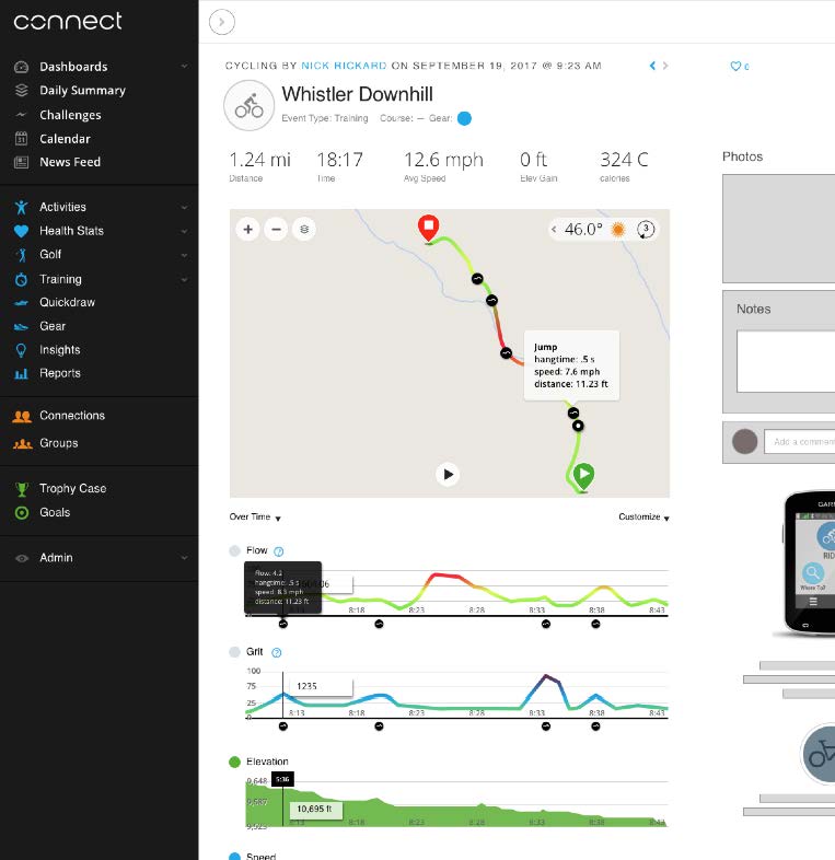
I led discussions about the meaning and amount of colors in the charts. I worked with the developers to define exactly which jump metrics would appear and to what decimal they would be rounded. I fought to keep the visualization of the gradient on the map polyline by reiterating the customer need of better data and a more meaningful display.
Strangely, the color of the gradients was the one piece of the design that took the most time to resolve. User testing on the physical devices was delayed due to issues with the production. This meant we could not get real data for the Grit and Flow scores from test rides and my designs were based on speculation. Once we received real data, I realized the variation of the peaks of the data would be much greater in the case of Flow and much less than I had anticipated for Grit. After a few more rounds of revisions, the stakeholders settled on 3 colors instead of 5 to represent the intensity of each chart and I finally got approval in the nick of time before release.
In the end, I believe we were able to produce a new feature that met a true customer need in a meaningful way.