
How might users find specific variables to enrich their geospatial data?
Design Methods: User Research, Gamestorming, Low-Fi Prototype, Wireframes, Flows, High-Fidelity Screens
Role: Senior UX Designer
I love maps. I always have. I remember tracing the curves of the road on the map to the Grand Canyon driving with my parents to the national park. I would try to keep track of where we were and how far we still had to go.
At Alteryx, I was tasked with taking over design for the Location Intelligence cloud app. The next big feature was to allow users to enrich a particular geospatial dataset with variables from a 3rd-party (e.g. the US Census).
Problems with the Existing Tools
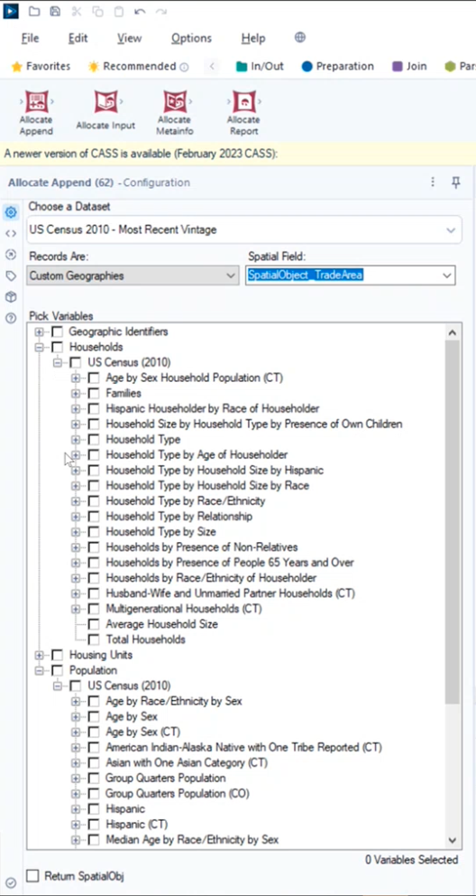
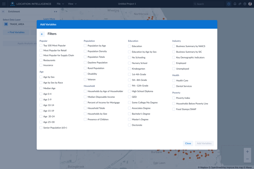
The existing tools within the desktop app were very hard to use. The user would have to select from a very deep hierarchical tree menu without a search. They would not know how many variables were in each item in the tree until they opened up each option. They could also select as many variables as they wanted without knowing how many they had selected which could actually crash the application if they selected too many.
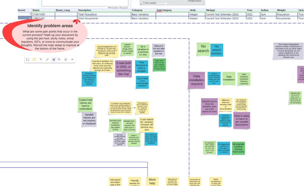
Collaboration Workshops
In order to tackle the problems, I set up a few workshops with the Product Owner, Business Analyst, and members of the development and UX teams. Through these workshops we were able to discover the problem areas and possible solutions. Drawing on the experience of all of these team members brought to light several important features that would make the new design a success.
Alteryx Inspire 2023 UX Lab
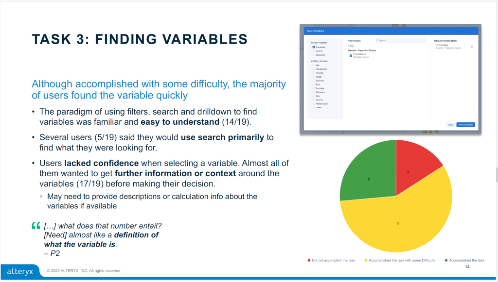
Each year, Alteryx invites their customers to come to a big conference called Inspire. My first year at the company, I used this opportunity to put together an interactive prototype of a proposal for the Enrichment feature. Over 200 customers would visit the 14 stations over the 2 days of the conference. The location intelligence station had 18 users test the prototype.
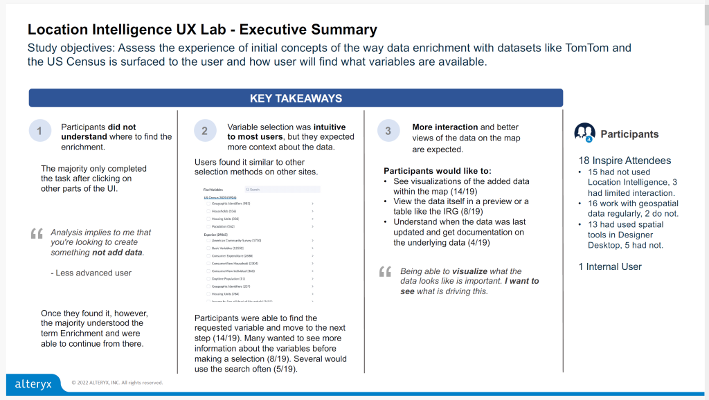
The results revealed a problem with our placement of the feature. Users thought of enrichment in context of the data on a particular layer instead of in the “New Analysis” section with other analysis features. However, the research confirmed we were on the right track of using a better tree structure with a search and “faceted” categories to narrow down the variable selection.
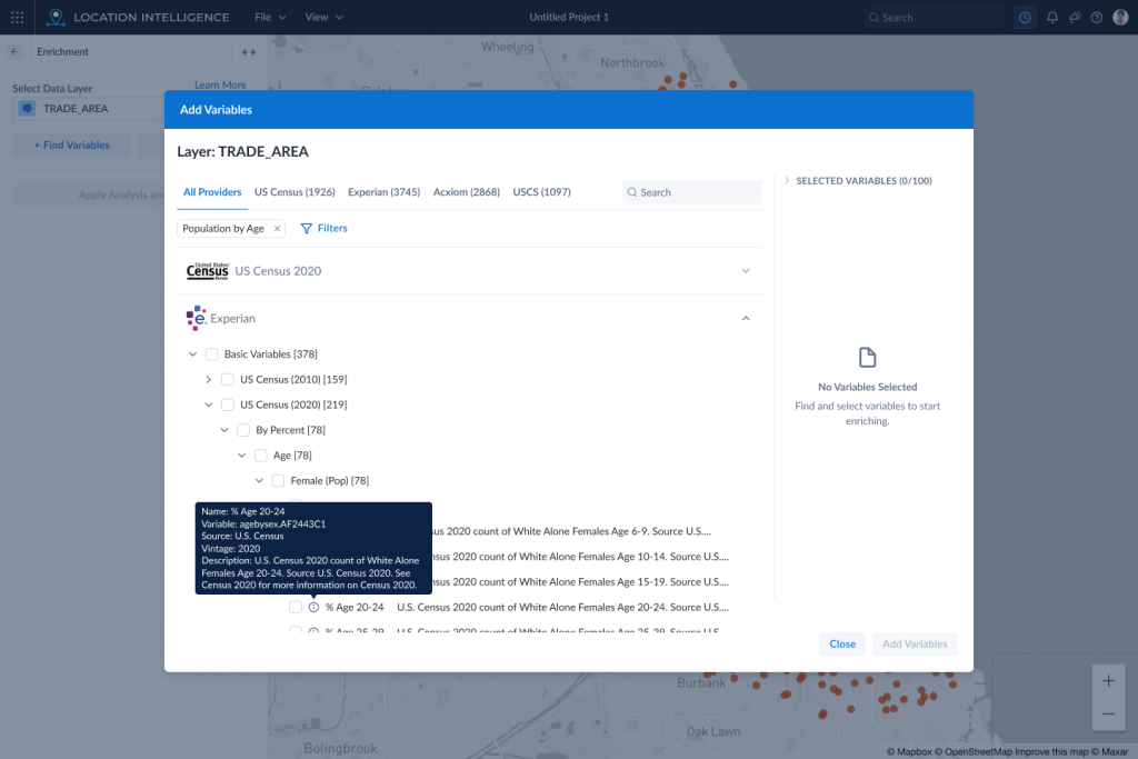
We also found that users wanted more context and details about a variable before selecting it. For many people in the geospatial analytics area, knowing information about the data is crucial to making and visualizing connections.
Recommended Designs
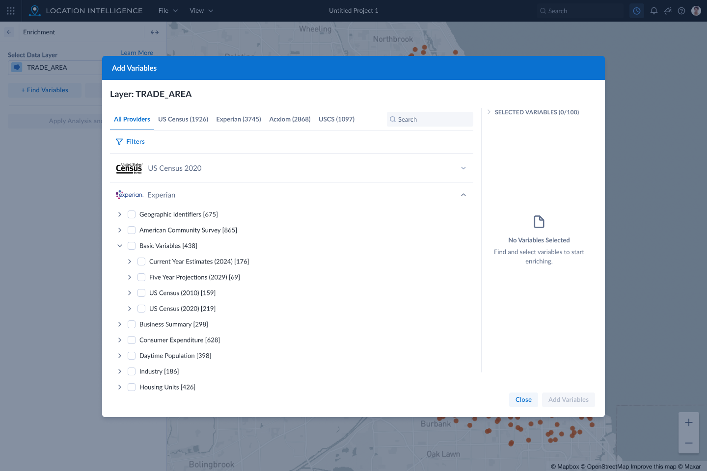
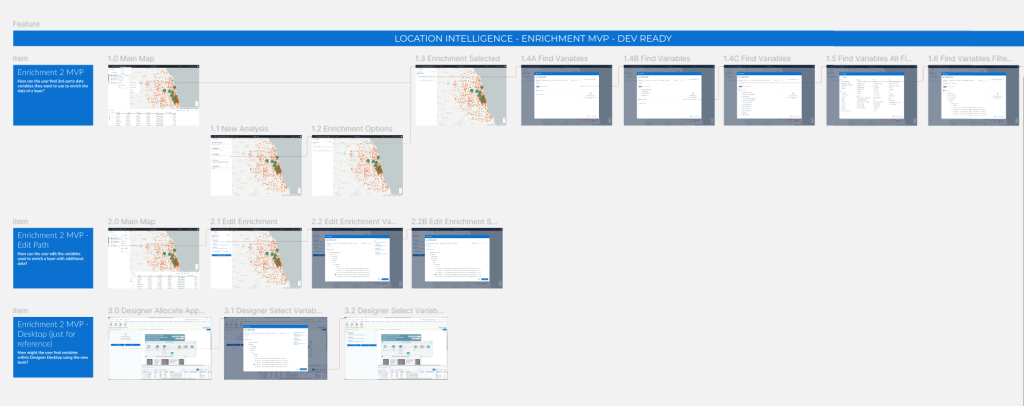
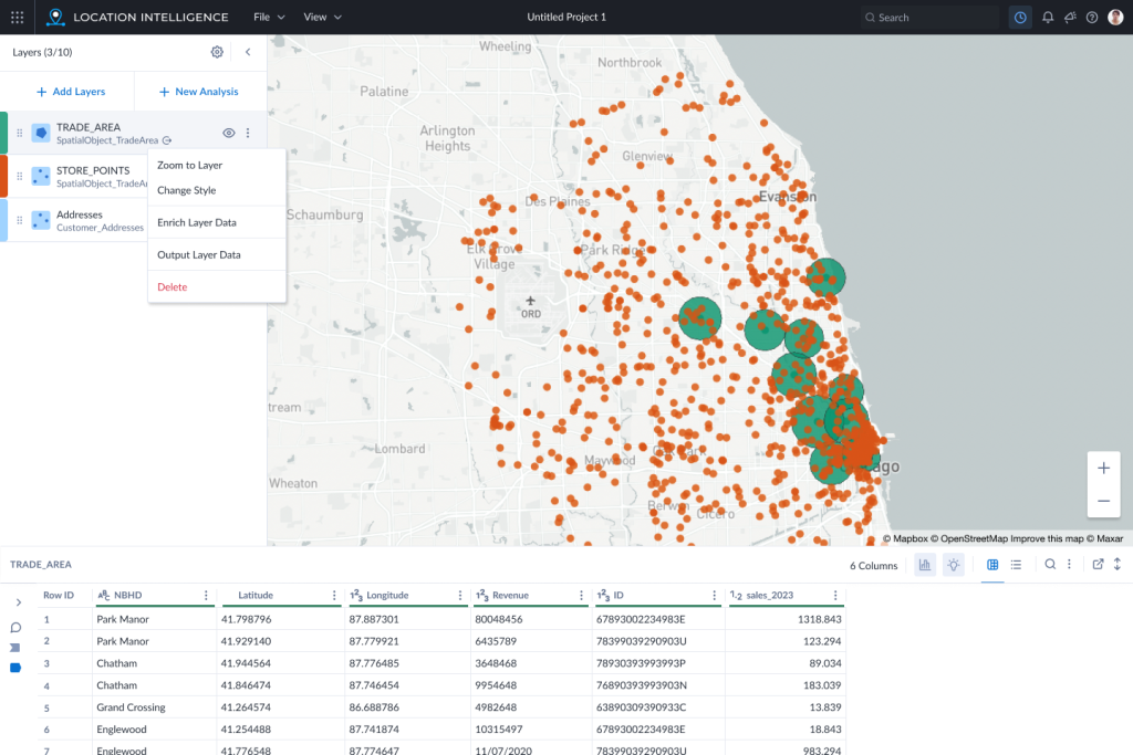
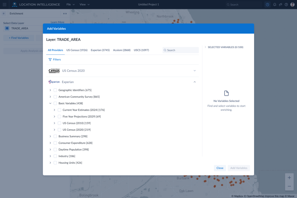
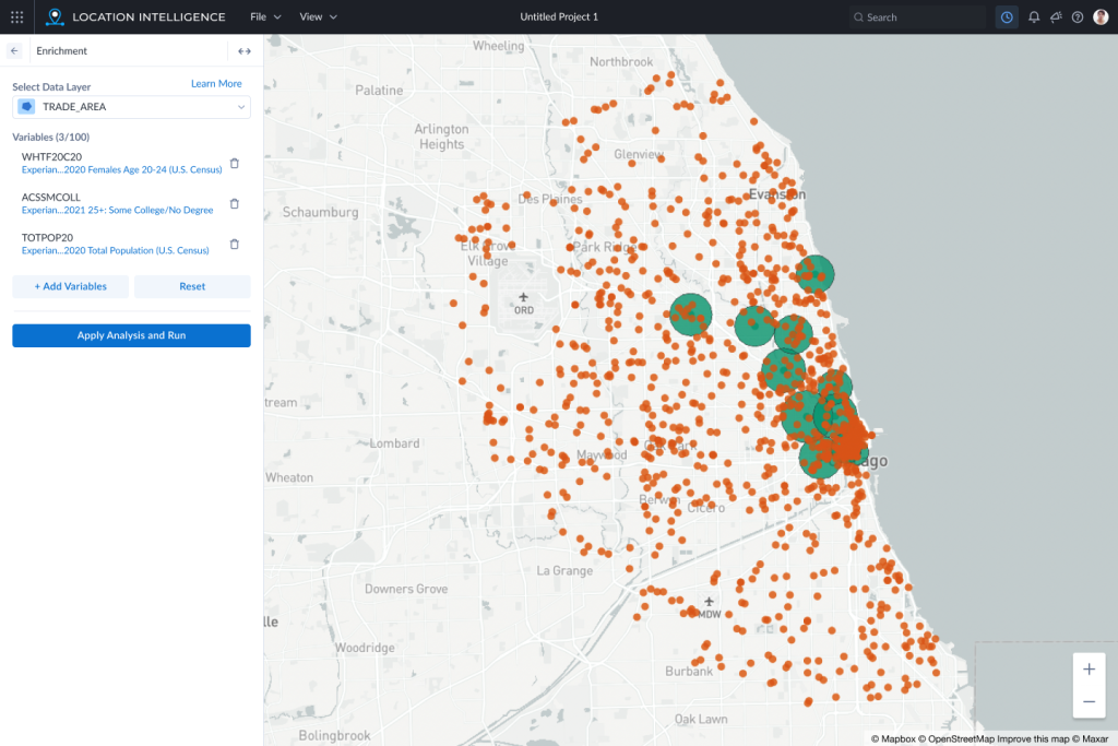
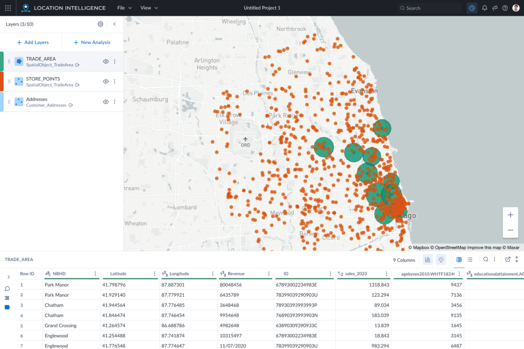
In the end, we settled on an MVP flow that maximized the benefits discovered through the research and workshops, but would also be practical to implement in a timely manner. We added enrichment to the 3-dot menu of the layers, grouped the variable trees by vendor, added a way to select filters for all the variables, added a tooltip with more context and a data table to show what is behind each layer.
Conclusion
Through collaboration and user research, we were able to land on a design that would give users tangible benefits and improvements over the current process. The design was also something which could be implemented by the development team who were excited to begin work after seeing the final screens in a kickoff.