Static Report Builder
Design Methods: User Research, Design Thinking, Affinity Diagram, Wireframing, High-Fidelity Screens
- Led workshops with product owner & development team
- Created flows and wireframes to confirm direction and requirements
- Presented final screens in kickoff with dev team to begin agile process.
My first project at Alteryx was to update the static reporting tool with a cloud version. The project was already underway when I took over the UX role, but had been stuck for a while on where to go.
Problem Discovery
A couple of months after I started, there was already an in-person meeting scheduled for several teams to get together and brainstorm.
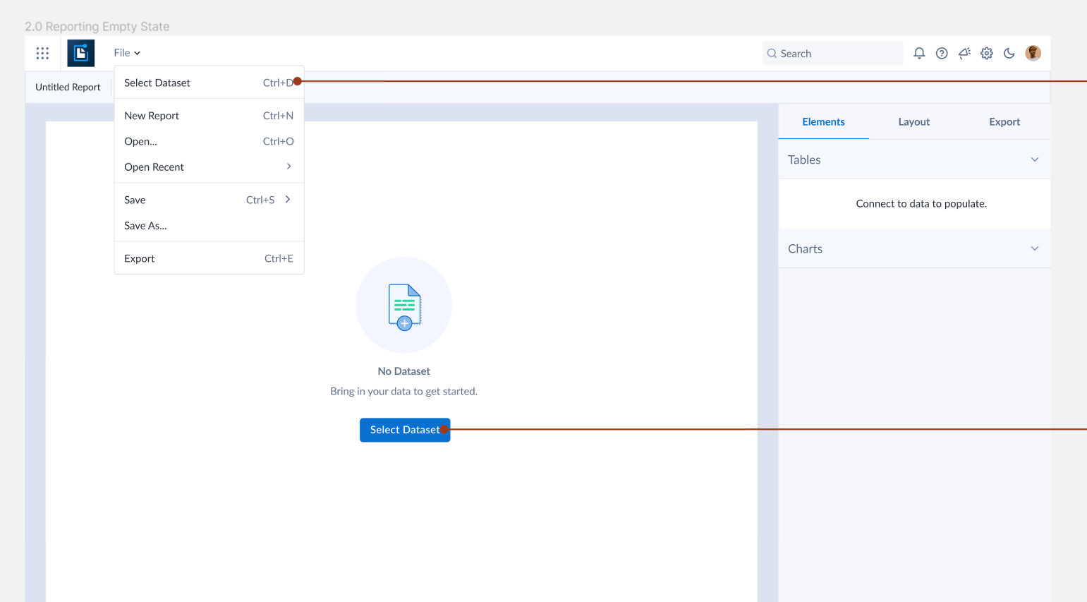
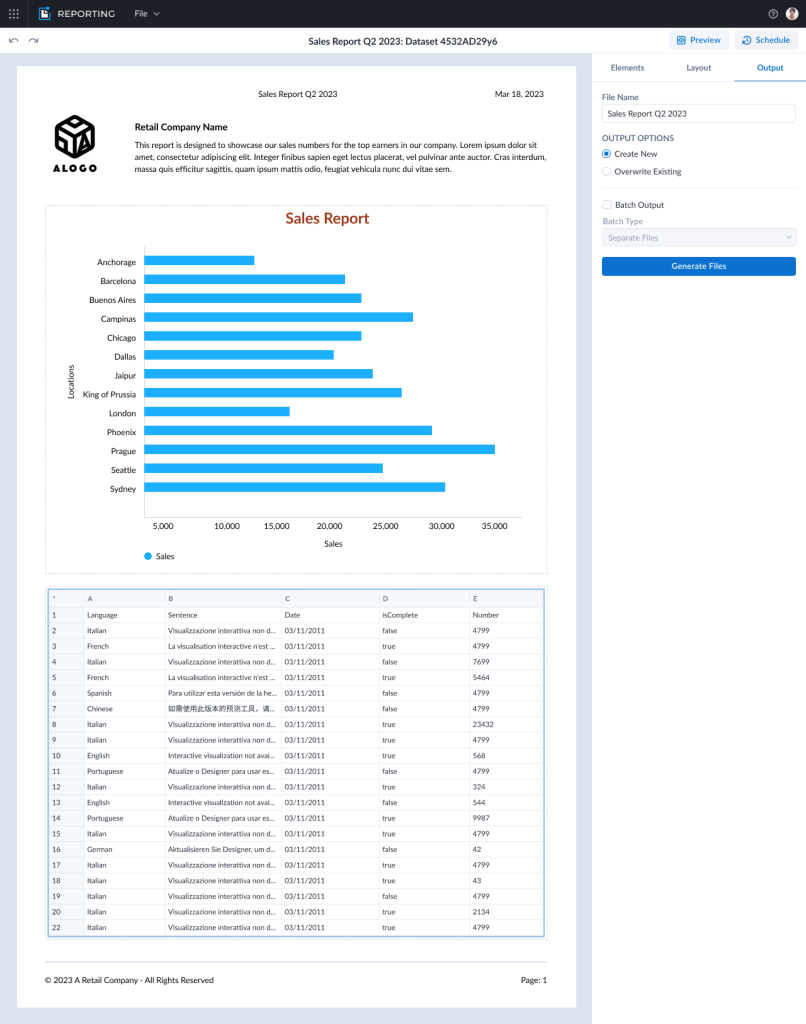
The biggest problem with the reporting tools in the desktop app was the fact that there is no visual (WYSIWYG) builder and everything must be placed by guessing the numbers for the X,Y positions. The report then needs to be generated and the numbers changed to re-place the elements.
Workshop Part 1
During the first part of the multi-day meeting, I was able to take advantage of being in the same physical space with many team members and organized several small workshops. We could talk about difficulties with the current product and prioritize features going forward.
Workshop Part 2
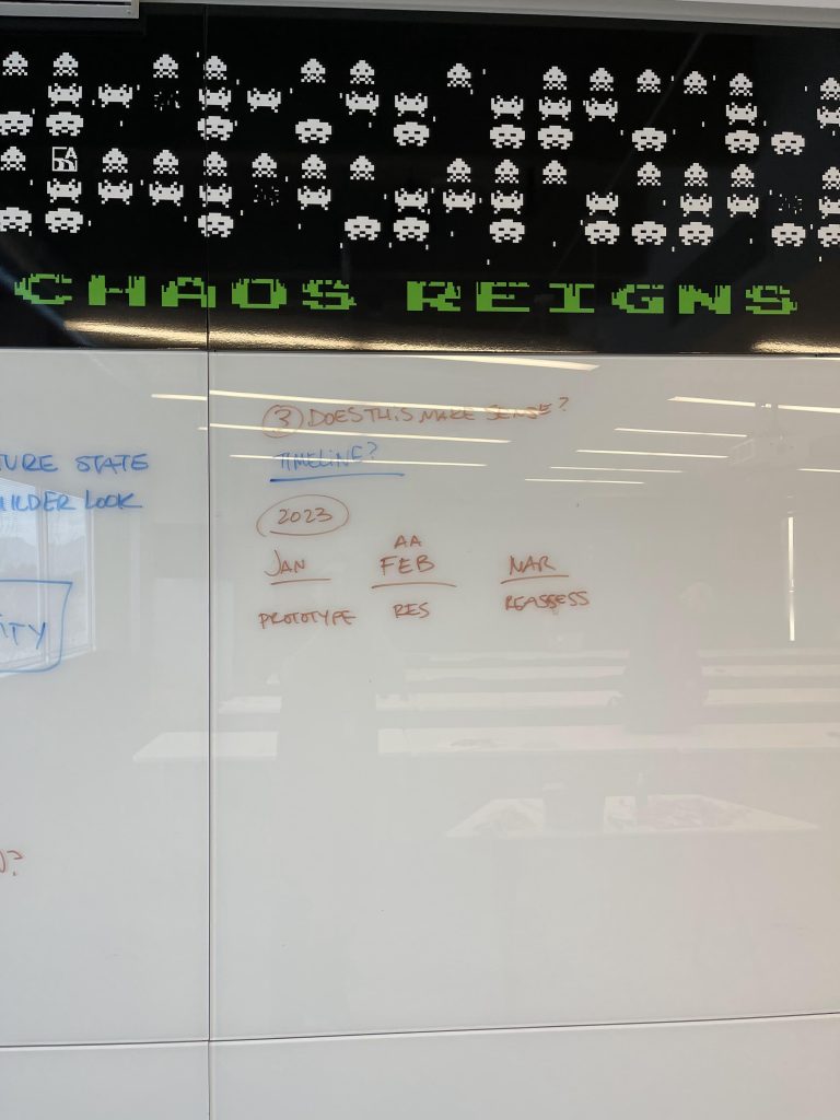
The second part of the in-person meeting was to figure out the direction of both the Reporting and App Builder projects. Because there is some overlap with visually building a report and visually building an application to display data, there was a question about whether we should combine these into one project.
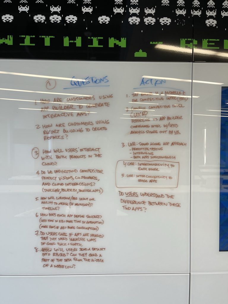
Working with both teams and using prior UX research findings we established the benefits and features of the products. The research was clear. There was still a definite need for a standalone static report builder. Users would often use exported data to build static reports in other applications with more features. They would send these reports on a regular basis to managers and other parts of the business to tell stories about performance and other metrics. This need was different from the app builder which would also create interactive charts to display to end-users, but would show more real-time data with which the end user could interact and make their own conclusions. Comparing the two with management, I was able to successfully defend the utility of what we were building and confirm the roadmap of features aligned with user expectations.
Inspire 2023
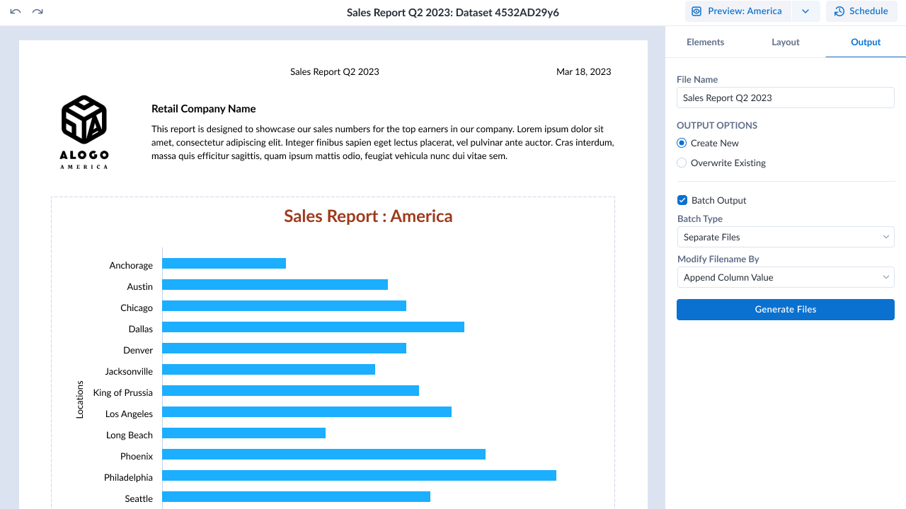
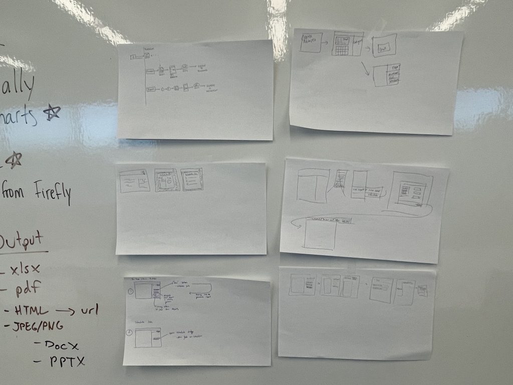
Each year, Alteryx puts on a customer conference where users are given the opportunity to see new products and get advice on their analytics. I was able to put together an interactive prototype that was shared in the UX Lab with a possible flow for how a user could create a report and schedule it for batch generation.
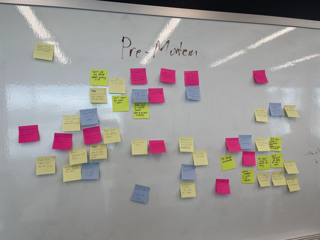
Research Findings
We had 16 people come through the UX Lab station. The biggest piece of feedback was that the app didn’t have enough functionality for users to feel like they would use it in their day-to-day work yet. They said they would specifically need the ability to import more than one dataset to show different kinds of data in one report. Many of them said they would like more types of charts and more options for styling them.
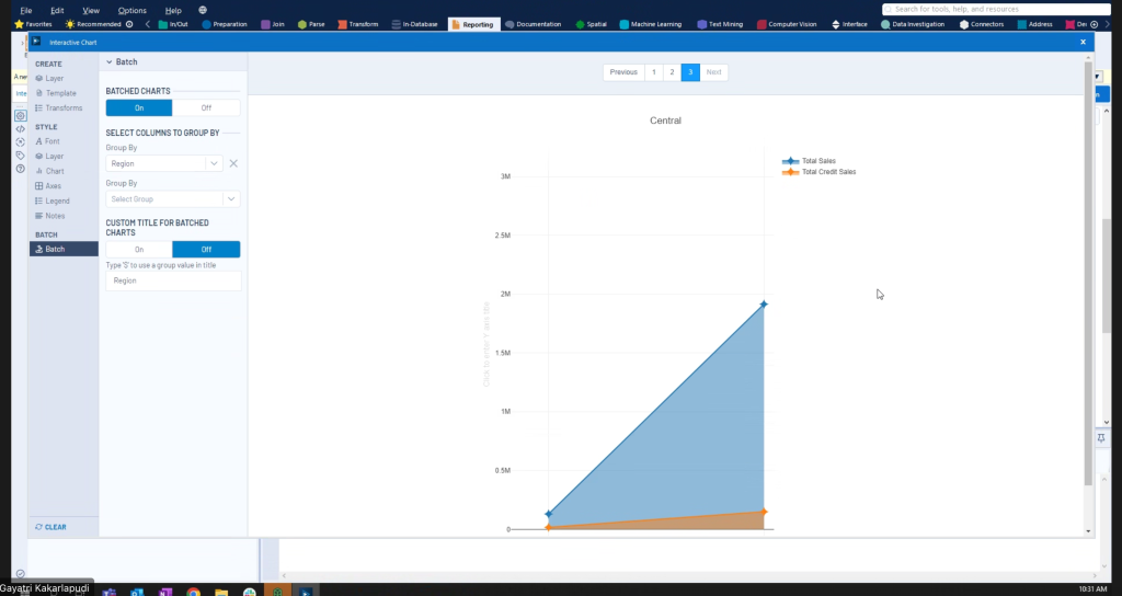
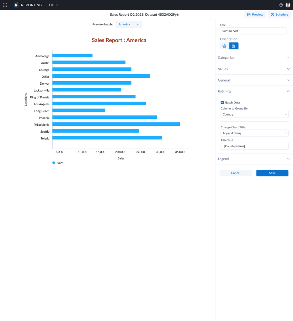
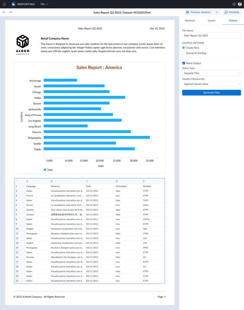
With regards to the batching prototype, most of them said they would like a feature that allowed them to automate the creation of a set of different reports on a regular schedule. But, they said the way we showed it working was too complicated and didn’t work like other software they were used to.
Conclusion
Listening and watching real users go through the static reporting prototype allowed us to find 5 ways to improve the existing app. Some of these were already on the roadmap, which gave us confidence that we were moving in the right direction. Others were new insights that we would not have gained if we hadn’t done the UX Lab. Two of the improvements were implemented by Q3 of 2023 and more were scheduled to go live by the end of the year.